Process
How a piece of candy becomes a small design
Hard candy is one of the few foods you plan on paper first. Long before anyone tastes anything, a design has to survive heat, pulling, folding and cooling — and come out looking like the idea that started it.
It starts as a color study
Nearly every Chromavale design begins as a flat sketch or a handful of color chips, not a recipe. Which navy reads as deep rather than black? How much pearl goes into a swirl before it looks grey? Where does the gold sit so it catches light only when the candy is turned?
Working out the palette first is practical, not precious. Sugar is unforgiving about contrast: two colors that look distinct as swatches can collapse into one another once they are translucent and lit from behind. A design that survives as a drawing gets a second, harsher test on a small test batch, where colors are checked against warm ivory paper, dark wood and a plain white plate — the three places candy actually ends up.
The pattern has to be built, not painted
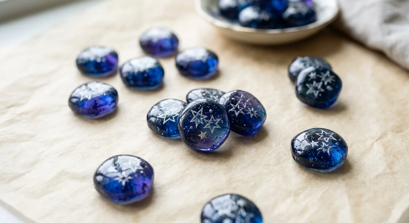
Patterned hard candy is assembled while the sugar is still workable. Stripes and spirals are formed by laying colored sugar against colored sugar and pulling the mass so the lines travel together. A mosaic face is closer to tile work: many small pieces, arranged by hand, then fused so the seams stay visible instead of melting away.
That constrains the design in ways a printed picture never is. Fine detail drifts. Sharp corners soften. A pattern can only be as precise as a warm, heavy material allows, which is why handmade candy looks slightly softer than anything extruded by a machine — and why the best designs lean into that softness rather than fighting it.
Why two pieces from the same batch differ
Anyone who has worked with sugar knows it has moods. A batch pulled a moment longer tightens every line in the pattern. A cooler room sets the surface faster, so an edge comes out a little sharper. Where a piece sits in the tray changes how quickly it cools, and the last pieces cut from a cane are rarely identical to the first.
So when you open a box and find one lollipop with a swirl that ends a few degrees off-center, or a mosaic seam that wanders, that is the record of a person working quickly with hot material. We would rather ship that than pretend to a machine's consistency. What should not vary is the standard: color that stays vivid, a clean, glassy surface, and a flavor that holds up from the first taste to the last.
A handmade piece carries small evidence of the hands that shaped it. Ours tends to be a millimeter of drift in a line, not a shortcut in the quality.
Presentation is part of the design
Candy is a visual gift before it is a taste. It is looked at in the box, on a table, in a photograph, long before anyone unwraps it. That changes how we plan a selection: a set of pieces needs to work as a group, not just one at a time.
- Grouping by temperature. Warm ambers and caramels next to deep navy gives a box a focal point. Six brights of equal weight can read as noise.
- Scale contrast. A large mosaic lollipop beside small drops looks deliberate. Ten pieces of the same size look like inventory.
- Quiet materials. Ivory, kraft paper and simple glass let the candy be the color. Foil and glitter compete with it and usually win.
- Air and movement. A little empty space in a box lets pieces be seen individually and keeps them from knocking together.
Storage follows the same logic. Hard candy keeps best cool, dry and sealed, away from strong light and strong smells — sugar picks up the scent of whatever sits beside it. A tin on a shelf out of direct sun is kinder than a windowsill, and candy kept in a humid kitchen will eventually go sticky on the surface even though it is still perfectly fine to eat.
Artistic candy versus the ordinary aisle
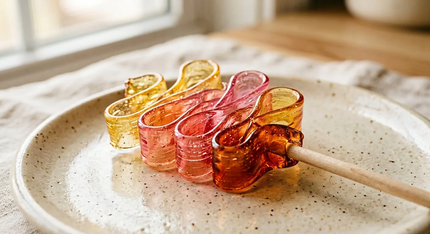
Mass-market candy is designed for a different set of problems: it has to survive a warehouse, a truck and a season on a shelf, in enormous volume, at a low price. That work is genuinely difficult, and it produces some excellent candy. But the design language is set by durability and uniformity, and the result tends to look the same from every angle.
A small batch can make different choices. It can use a color that fades if left in sun. It can build a pattern that only makes sense at one size. It can accept that a swirl will drift. In exchange, the piece is worth looking at closely — and worth photographing before anyone eats it, which is honestly what most people do.
What to look for when you choose
If you want a piece that reads as a gift on its own, pick something with a strong silhouette: a large round mosaic, a ribbon with a diagonal edge, a lollipop whose swirl faces the viewer. If the candy is going into a bowl or a favor bag, smaller drops with dense internal pattern survive better — they still look interesting when a handful are jumbled together.
And if you are choosing flavors for a group, remember that the guessing is half the entertainment. A box with two or three very different flavor directions starts conversations that a box of one familiar taste never will.